REDESIGN A LOGO
Redo Maldam Logo in Adobe Illustrator. Create a variety of Logos.
VISUAL IDENTITY
Create an Identity through Tone, Colours, Logo and Typography
HAVE A SCALEABLE WEBSITE
Have a Responsive Website by having a design system in place with a consistent setting.
Previous Brand Colours:
The original pastel palette felt fleeting and playful, which undercut the collective's goal of being seen as a permanent, serious institution. I shifted the spectrum to Midnight Purple and Deep Forest Green. This darker, higher contrast scheme is not just for aesthetics, it signals prestige, permanence, and mystery, aligning the brand with their high end ambitions.
AEA3FF
C6BDFD
D6FEBF
CCFFC4
Visual Identity: OLD LOGO
The project began with a crisis: a trademark conflict in the UK forced a name change from 'Malgam' to 'Maldam.' Instead of treating this as a setback, we used it as a catalyst to mature the brand. We moved away from the literal interpretation of the old Pantheon logo and developed a bolder mark that could survive both digital scaling and legal scrutiny.


The pillars and the pantheon represents each artists to compile as a collective.
Logo Variations

The following Logo has been trademarked by MALDAM™ in 2024 for legal right to use.
Primary Logo: with details and serves as the main representation across all platforms.

Secondary Logo: Simplified version ideal for small spaces, in print or digital format. For compact spaces.

Submark: a simplified version, ideal for smaller spaces in print or digital format, ensuring brand presence even in compact areas.

Favicon: A tiny browser icon. it enhances brand recognition and facilitates brand identification. Serving as both a reminder and a brand booster.

Visual Identity: New Brand Colours
#1b1b1b
#fefefe
2E3A28
321F37
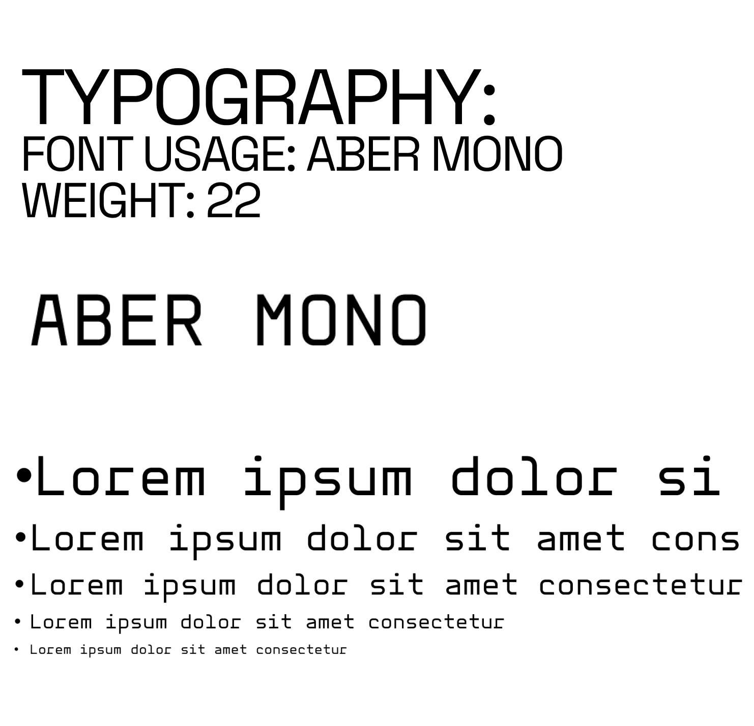
Visual Identity: Typography
Tone:
Be aware of your language use
Talk about your product or service in a way that aligns with the brand's / company's values
Perception is multi dimensional
Minimal, contemporary, sustainable, functional
Mockup:
I approached the contents of the website in Figma with a column styled layout, and divided them into rows, making it 5 square elements in each row.

Lottie Animation:
With a rebranded and newly trademarked logo. I took advantage of it and decided to make a Lottie Animation with the Logo revolving with scrolling view.


The Lottie Animation was made through Blender and was rendered individually by frames.

Responsiveness:
Viewport Height for desktop and Mobile:


I engineered a strict viewport dependent grid, ensuring the 'gallery wall' aesthetic remained unbroken whether viewed on a 27 inch monitor or an iPhone.


Design System: Accessibility
Inspired by the brutalist utility of sites like pg-lang, I stripped away text heavy navigation in favor of a shape based wayfinding system. By using universal geometric forms as navigation anchors, we bypass language barriers, making the site intuitive for the collective's international audience.


I also included a live updating date with the time and calendar at the bottom of the website and is respective to any users clocks.


